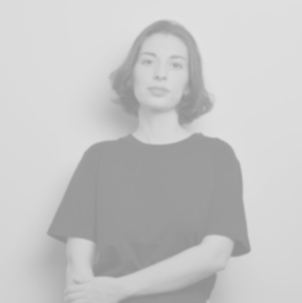
Cette semaine nous vous présentons la designeuse et photographe portugaise,
Sara de Campos.
Sa pratique, Sara la développe pleinement sur ces deux médiums artistiques et de manière bien distincte. Ses créations lui ont valu récemment de prestigieux prix. En 2018, elle remporte notamment le Grand Prix de la Design Parade de la Villa Noailles à Hyères avec son projet « Mediterranean Table».
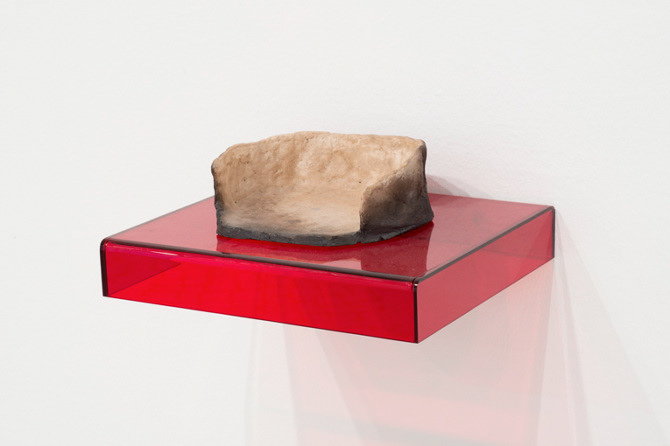
Les créations design de Sara témoignent d’un regard pleinement en prise avec la réalité quotidienne et ses usages. Ses objets au design épuré rencontrent une palette de couleurs récurrente dans son travail que l’artiste affectionne particulièrement.
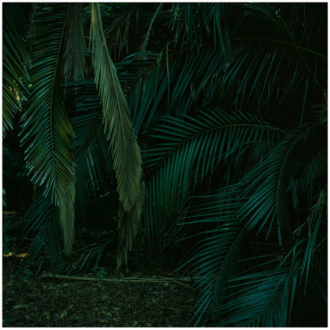
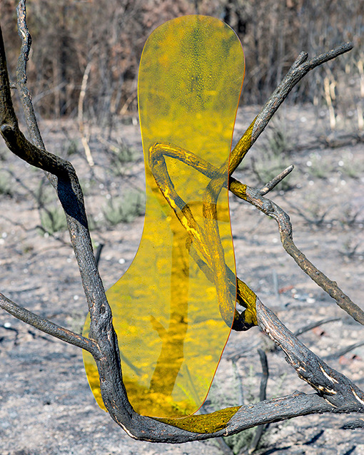
Des couleurs que l’artiste exalte encore plus loin par l’usage souvent de monochromes pour ses photographies. Ils recouvrent divers motifs dont ceux de la nature, l’une de ses principales inspirations.
Sa pratique, Sara la développe pleinement sur ces deux médiums artistiques et de manière bien distincte. Ses créations lui ont valu récemment de prestigieux prix. En 2018, elle remporte notamment le Grand Prix de la Design Parade de la Villa Noailles à Hyères avec son projet « Mediterranean Table».
Les créations design de Sara témoignent d’un regard pleinement en prise avec la réalité quotidienne et ses usages. Ses objets au design épuré rencontrent une palette de couleurs récurrente dans son travail que l’artiste affectionne particulièrement.
Des couleurs que l’artiste exalte encore plus loin par l’usage souvent de monochromes pour ses photographies. Ils recouvrent divers motifs dont ceux de la nature, l’une de ses principales inspirations.
Could you introduce yourself ?
I stablished my studio in Lisbon Portugal in 2017, for product design and photograpy. I’m graduated in 2017 with a Master degree in product design at ECAL, Lausanne Switzerland, and in photography in 2015 at Ar.Co, Lisbon. In 2018 I won the Grand Prix of Design Parade at Villa Noailles Hyères, and a special mention by Braun with the project ‘UVA’, in photography a Swiss prize MLL by VFG Nachwuchsförderpreis in 2016.
L'artiste Sara de Campos
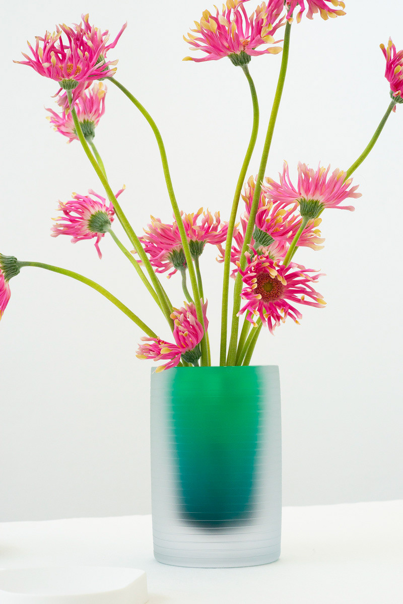
The ‘Mediterranean Table’, 2019
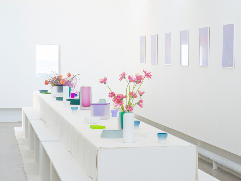
The ‘Mediterranean Table , 2019
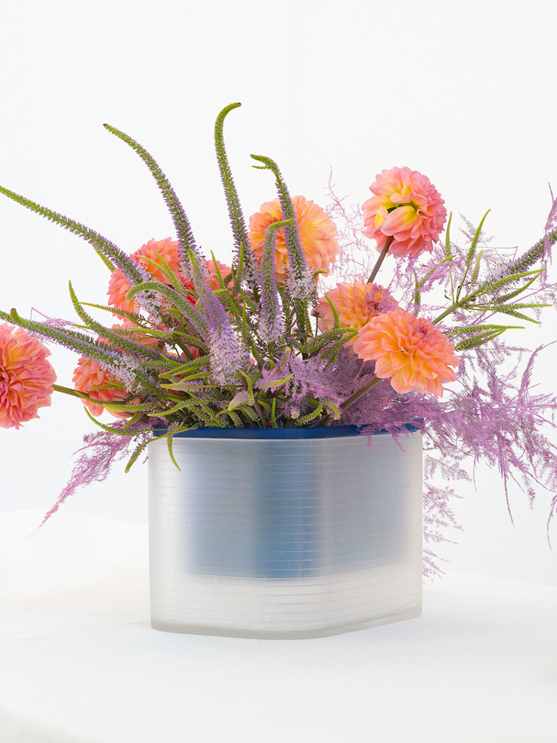
The ‘Mediterranean Table’, 2019
Could talk about your artwork ?
It’s important to me to separate my practice in photography from the product design one.
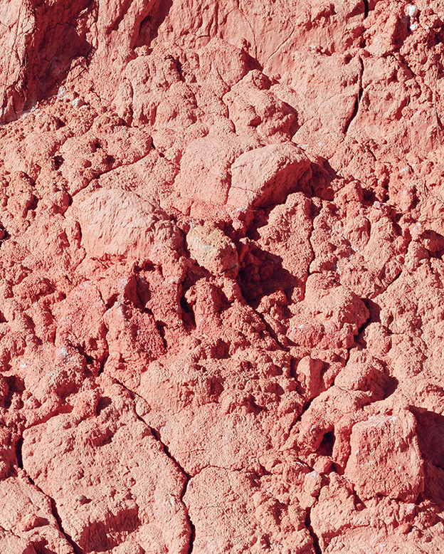
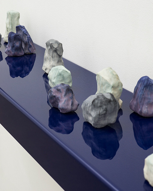
Regarding my artistic practise, it is characterized by the use of photography, and one of main subjects is dealing with the perception of history, and creating a dialogue between past and future. Geological events and its relation with human presence on Earth are often explored as well.
Casa, Inkjet print, several materials 2014/2015
Pangaea, 2015-2016
Pangaea, 2015-2016
Pop colours like blue, purple, orange come often in your work. Could you speak a bit about it? We notice that you take many photographs too with a deep search of colors too. What does photography bring to your practice of ceramic works, to your global projects?
I recurrently come back to the same colour palette (blue, purple, yellow, pink), I feel it’s part of the work and important as everything else, it’s not just a finishing. I translate the care for details and colour combinations in my bidimentional work and tridimentional ones. In a way, there is a bridge between both practices, however they fill completly different purposes. But in my design practice I keep the same purpose in colour’s use, it’s part of an object not just a random final option.
Republic
Republic
Could you talk about the material you use?
In photography I work with both analogue and digital processes. Silver gelatin prints on barite paper or ink jet on bartite paper in case of digital process.
What are your main inspirations?
Nature, history and everyday places. I’m quite focused on surroundings and gestures of daily life.
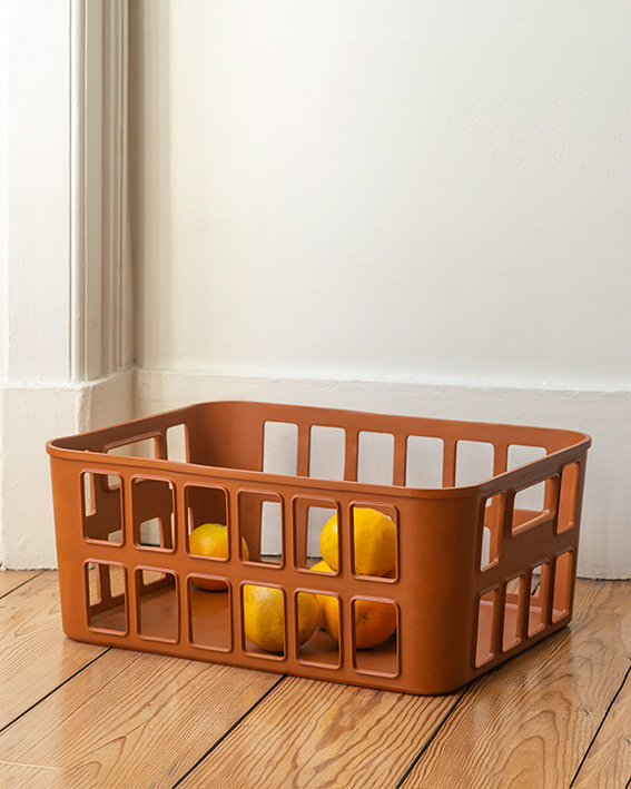
Domestic basket, made of vegetal based polymer, 2020
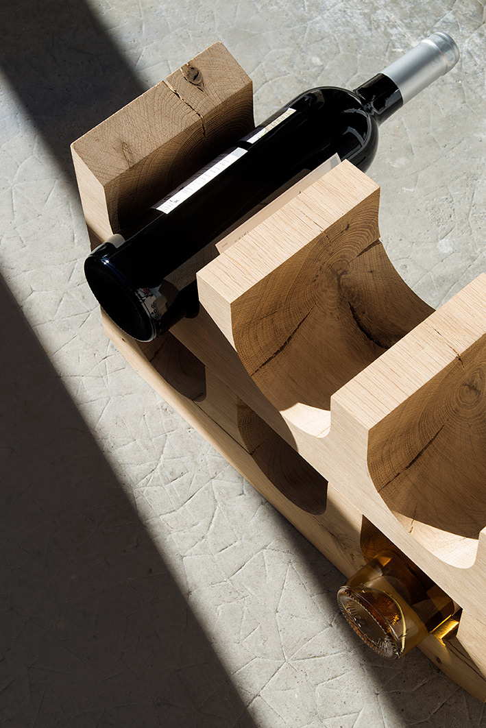
Cask, 2016
Do you have any projets?
I'm keep working in both fields even though the current situation place some obstacles in creative and artistic practises. I’m participating now at Dutch Design virtually, and I have scheduled an exhibition next year at Château de Borély in Marseille.
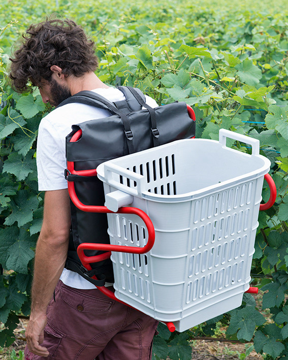
UVA, 2017
Pour découvrir toutes les créations design de Sara de Campos rendez-vous sur ce site:
https://studiosaradecampos.com
Concernant son travail photographique, ce site lui est dédié: https://www.saradecampos.com
Et pour ne rien manquer de son actualité, nous vous conseillons sa page Instagram !
https://www.instagram.com/sara.decampos/