Last month, I had a great conversation with British Artist:Johnny Izatt-Lowry.
Johnny Izatt-Lowry was born in Durham in the North East of England. In this interview, the artist explains that he spent his childhood drawing. He drew from pictures taken from magazines and books. It was therefore natural that he chose to devote himself to his practice. He completed a BA at the Ruskin School of Art and an MA in Fine Art at the Slade School in London. The particularity of Johnny Izatt-Lowry's work is that he works on crepe paper. A medium that is very thin and difficult to control, which appealed directly to the artist. «The crepe seemed to be in control as a surface, you kind of had to fight against it. There was this haziness to the images, which was created by the combination of the texture of the fabric and the pastels and not necessarily me. Since then I have worked with a series of materials on crepe (..). The results are changing slightly with each medium, I feel like I’m constantly developing a technique. » explains the artist. The result is particularly mysterious and dark images, but always in pure compositions. Often a work presents a single motif: a silhouette, a still life or an object. The artist is keen for his compositions to be easily identifiable and familiar, so that viewers can project themselves into his subjects, and he doesn't hesitate to use familiar motifs, whether everyday objects or quotations from well-known paintings. But you'll see how the artist likes to play with their apprehension and strangeness: truncated, ghostly figures, floating objects... all mysteries that invite the viewer to immerse themselves fully and look at them for longer.
Johnny and I talked about his technique, the way he chooses to represent his subjects and arrange his compositions, and what he wants to evoke in the viewer. The artist also shared with me his creative process and his main artistic references.
Self portrait, drawing, 2020, pigment on crepe 30cm x 40cm
« I have worked with a series of materials on crepe (…) There’s always a building up of thin layers of colour, no matter which materials I’m using and I guess that’s what I’m most interested in. Feeling like the image appears on the canvas slowly as new layers are added, I think it gives them a dream like quality, and a fragility. »
Johnny Izatt-Lowry
Could you introduce yourself?
I grew up in Durham, in north east England. From what I remember I spent my childhood drawing. I was always drawing images from magazines and books. I don’t remember ever wanting to do anything else really. I then went to do my BA at Ruskin school of art and a few years later my MFA at Slade in London, where I’ve been working since.
You work with pigments on crepe - a support and mediums that are particularly fragile. How did become an integral part of your practice ? What do you like about this support and these medium ?
I started working with crepe as a fabric when I was studying at Slade. I had chosen it in a fabric shop near where I lived as it was relatively cheap and it had a texture which I felt held the powder of the ground-up soft pastels I was using at the time. I remember the process felt slightly out of my control, which I liked. I had been very used to being in control of mediums having mostly worked with coloured pencils on paper and oil on board. The crepe seemed to be in control as a surface, you kind of had to fight against it. There was this haziness to the images, which was created by the combination of the texture of the fabric and the pastels and not necessarily me. Since then I have worked with a series of materials on crepe, dry pigment, pastel pencils, and most recently coloured pencils. The results are changing slightly with each medium, I feel like I’m constantly developing a technique. There’s always a building up of thin layers of colour, no matter which materials I’m using and I guess that’s what I’m most interested in. Feeling like the image appears on the canvas slowly as new layers are added, I think it gives them a dream like quality, and a fragility.
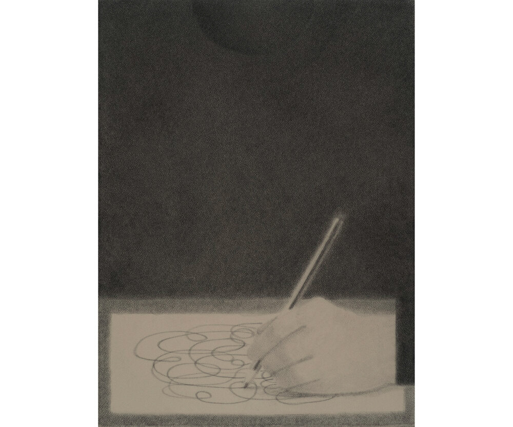
Your work has the particularity of never representing a person or a character. Their presence is only suggested by the shadows of silhouettes or the smoke of a cigarette. The latter is held in a hand that always emerges from a hieratic costume worn by a ghostly body. Can you tell us a little about this iconography ?
I think I like to keep the subject matter general in a way. I want the audience to feel they recognise the subjects (whether its a suit or a shoe) as if it was from their own dream or recollection. For me, a whole figure could be too specific, maybe you’d feel like ‘I don’t know this face’,. I guess if it’s a shadow or a suit though you can attach any body to it. There’s an uncertainty to the shadows and headless hands, their hard to pin down.
I noticed that if a face appeared head-on, it wasn't that of a character. It's represented geometrically on objects like a wooden chopping board, as if you were bringing these objects to life by giving them a human aspect.
There’s a sense of the uncanny in those faces which I was interested in at the time. They’re smiling but they don’t feel happy, and they had these empty eyes which I thought was interesting. You’d think a smiley face would feel light, but there was almost a sadness to them. I guess the objects in my paintings always feel a bit like characters in my paintings. They repeat over paintings and shows, like they’re people we meet again in different contexts. The smiling face definitely had this feeling too, like it haunted a few of the paintings at that time.
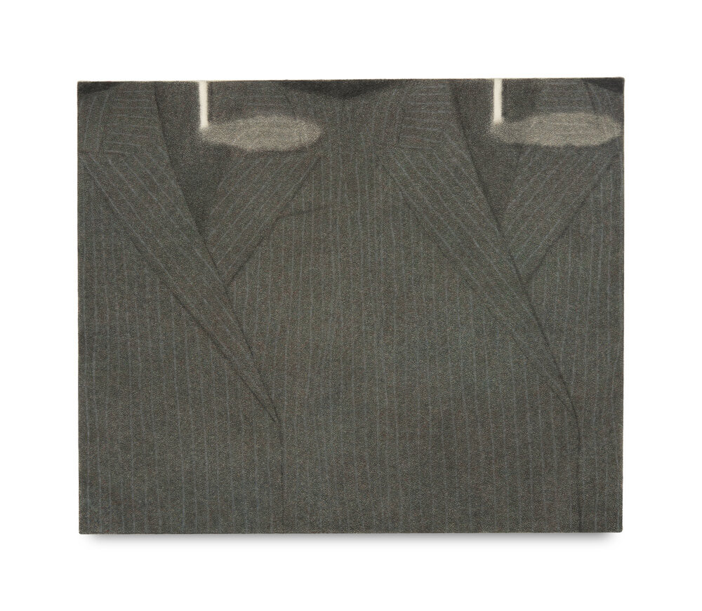
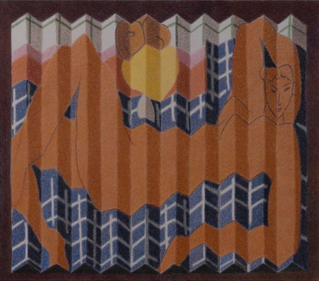
Two suits, 2021 pigment and pastel on crepe 61cm x 51cm
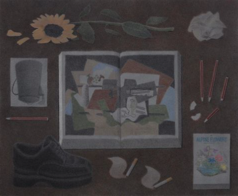
Objects play an important, even central role in your work: they are either isolated on the paper in stripped-down compositions, or presented in skilfully organised compositions. What interests you in the representation of objects ?
I’ve always been drawn to still life paintings. Often they’re not about the objects themselves but more about something else, whether it’s playing with space, perspective, light or just paint. They’re very playful! For me its the same, I’m interested in the way that these objects can be arranged to give some idea of physical space (like a table top), but in a completely unnatural way. It’s never really clear in my still lifes, for example, if you are looking at the objects from above or straight on. They kind of sway between the two in every paintings, and they’re usually surrounded by a sea of one colour. It’s normally just a small shadow holding them in place. In most of the paintings, we’re familiar with the situation (a book and two cigarettes on a table, for example) and yet the more you look at it the more it falls apart. The book is neither laying flat nor standing up, with the smoke rising slowly next to it, the compositions always unravel slightly the more you try to make sense of their space.
Among these objects, clothes and shoes, but also postcards of works (by Matisse, Rothko, Picasso) often appear and seem to have a special place in your iconography. How do you relate to these objects, and what do you want the viewer to experience?
There are often references to other artist’s work in either the form of books and postcards. Partly it’s again about taking something familiar to a viewer (A Matisse painting for example) and playing with it, pushing it into the unfamiliar slightly. There’s also a sense of working with the things that surround me. A lot of the subjects tend to be things I see around me at home or in my studio, whether it’s the books I own or a particular kind of shoe or fruit. They often find their way into my work.
Smoke is also central to your work: when it's not explicitly represented by cigarettes, it envelops your compositions, giving them a hazy, nocturnal and enigmatic aspect. What do you want to convey with this approach to representation and light ?
I keep finding myself adding cigarettes to some of my compositions but it’s definitely more about the smoke than the cigarette. I like the fact that they act as a thin, transparent layer in the paintings. Unlike the heavier objects around them which can feel dense and static smoke has a lightness to it, it has movement in what can otherwise be very tight, unmoving compositions.
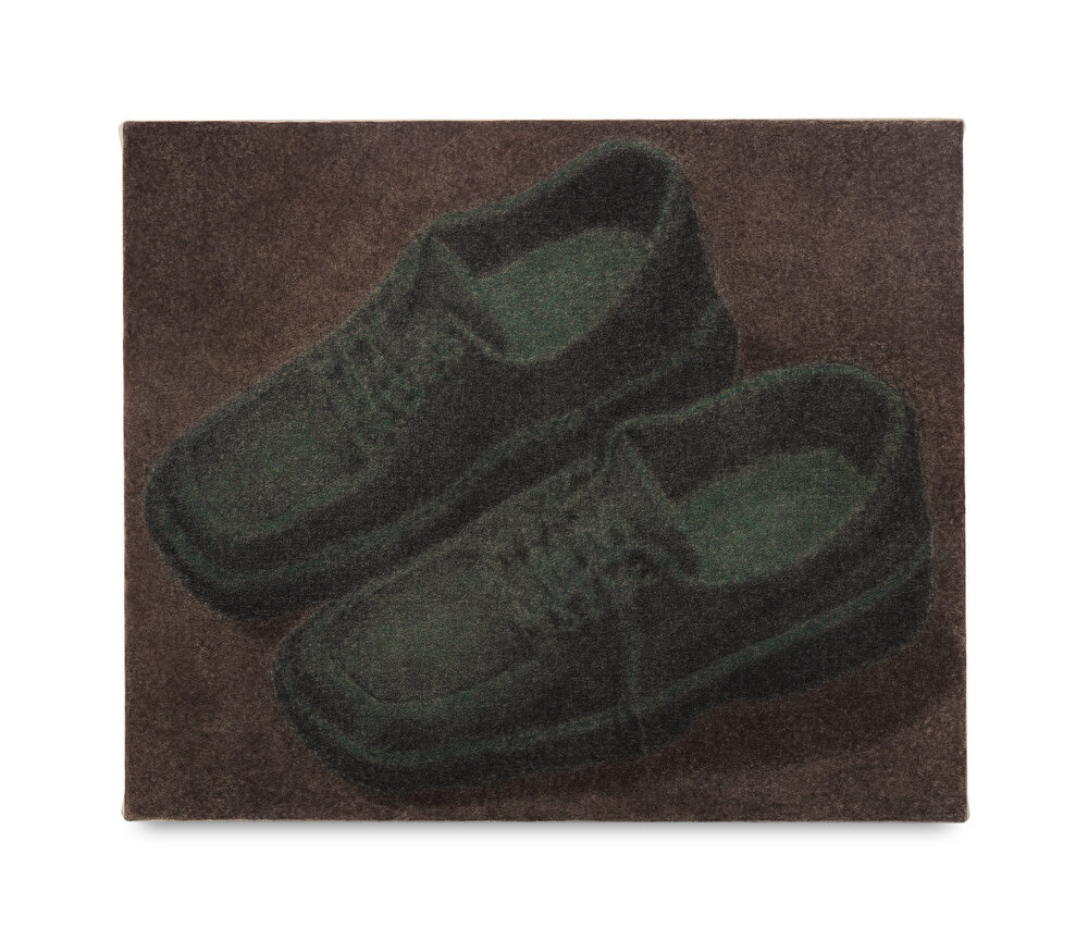
A pair of shoes, at night, 2021 pigment and pastel on crepe 61cm x 51cm
I've noticed that your work is often done in series ("selfportrait as", "Face") or depicted a motif in pairs (Two books and two cigarettes; Two jeans...). What interests you about the series and the duplication of motifs in pairs ?
Again there is a uncaniness to the pairs. Something that takes them away from reality, it’s like the object has been copied and pasted in the composition. There’s always this sense that what you look at has been constructed me. It happens quite early on in my process when I’m working to create the image in photoshop. The works aren’t painted from life ever and so I want there to be a feeling that reality has been distorted and forced into a certain composition. That’s when the objects get cloned.
What is your usual creative process?
Usually I start in photoshop, laying out rough compositions, pieced together from images I’ve found on the internet and photos I’ve taken myself. It’s really just to pin down where I want things to sit in the frame. I’m interested in how subjects can swell to fill the borders of the canvas or form a slightly too structured composition in its centre. There’s always a feeling that reality has been contorted to fit with in the rectangular confines of the canvas. I then usually make drawings from this initial composition and then finally commit the work to canvas. At this point I’m not really looking at the initial subject at all really, I’m just trying to think what it would look like (where it’s shadow would fall, or what colour it would be in the dark). With each step it takes the subject further from its initial reality, I guess that’s what makes them feel like dreams/memories of an object, because in a way they are.
What are your artistic references and creative inspirations?
I’ve always been interested in the early renaissance. Early this year I took a trip around Tuscany to view all the Piero della Francesca paintings there. There’s such an order and balance to his compositions and at the same time they feel effortless. You see how each figure, and each object has its specific place in the composition, if it moved slightly to either side the whole thing would be thrown off balance. They’re not trying to be reality, they’re trying to be a painting.
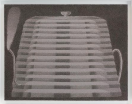
A kettle, 2022 Pigment and pastel on crepe 90cm x 70cm ⠀
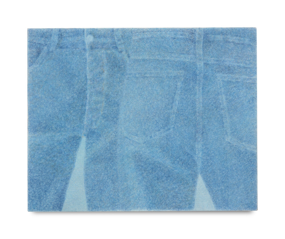
Two jeans, 2021 Pigment and pastel on crepe 41cm x 51cm
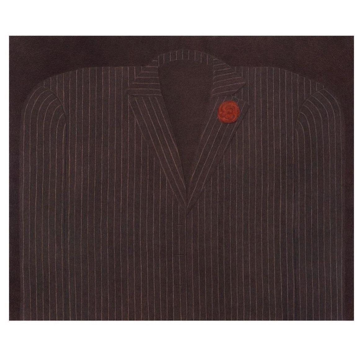
A suit, 2023